The Grand Theft Auto Definitive Edition remasters were highly controversial and to this day, their quality remains contentious. These Unreal Engine 4-powered game updates modernised the three classic PS2-era GTA games - GTA 3, Vice City and San Andreas - with much more advanced rendering technology. At the same time, the reworked lighting was very different from the original titles and the updated assets didn't hold up to close scrutiny. Some two years later, these titles have been released for mobile devices, with versions for iPhone, iPad, and Android. These promise the same updated graphics, paired with considerable lighting improvements. So how do modern iPhone and iPad devices cope with these divisive remasters and do the new lighting effects rehabilitate their visual designs?
The GTA Definitive Edition titles adopt a very different visual tone from the original games. San Andreas was the most severely affected, lacking the sepia-toned haze that defined the original release. GTA 3 lost its blue and green tint, and Vice City had a pretty neutral look. Basically, all three titles look bland when measured up against their PS2 forebears, which had distinctive visual styles. Looking at the iOS version of the game it's clear that the lighting has been dramatically overhauled to bring it more into line with the original games. During gameplay, distant detail is occluded somewhat by a sort of blueish distance fog, giving the game a hazy and slightly oppressive feel.
If we go back to PS2, this kind of fog effect served a dual purpose, obscuring pop-in on the relatively weak hardware, and providing a sense of atmospheric scattering, so its replication on iPhone doesn't need to occlude as much distant detail. As the day fades away, this effect takes on a hazy, orange look, as the sun's rays travel through a thicker layer of atmosphere.
The same is true in GTA 3. The original Definitive Edition remasters present with a clean, sterile tone, while the new iPhone versions give it an obvious blue-green tint. The sky also has a very different appearance here. If we circle back to the original title, we see similar artistic flourishes, which helped define the look of this early PS2 classic and definitely set it apart from the Definitive Edition on consoles.
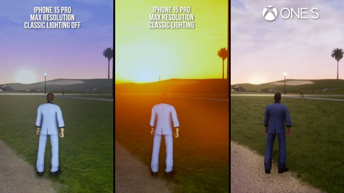
Vice City probably fared best of the Definitive Editions, with an overall visual appearance that didn't feel too far from the original game. Even still, there are some changes, like how the sun takes on a vibrant, overwhelming look at sunrise. It does vary a little from the original, but I think it gives the game that sun-baked Miami look that the original title tried to achieve. The revised lighting also significantly affects the colour of the water across all three games. It tends to appear darker across a range of lighting conditions, which lends the water a slightly more realistic appearance. The opacity and use of reflections on the water do seem very similar though.
I've been discussing the game running under its 'classic lighting' setting but it is possible to turn it off where we get a lighting presentation that is quite similar to the earlier Definitive Edition releases. It's not exactly the same, but it does resemble those releases much more closely, if you'd prefer a more neutral lighting style.
Overall, I think the updated 'classic lighting' is a big improvement over the earlier DE versions, and it resolves one of my major contentions with those games. The revised lighting clearly takes a lot of inspiration from the original titles, and in doing so it brings these new releases stylistically much closer to those games. But of course, there are a variety of settings tweaks and adjustments beyond the broader lighting changes. Relative to Xbox One S - the weakest of the eighth gen consoles, we're mostly looking at cutbacks.
Texture filtering, for instance, operates at a much lower level of fidelity. The alpha textured grass is reduced in volume or absent across these games as well. The cubemap-based interior maps of indoor environments are gone. Speaking of cubemaps, the real-time cubemaps on the player car are also absent here, though the game's screen space reflections remain to fill in some of the reflection detail.
There are plenty of smaller tweaks to lighting. The games have simpler ambient occlusion now, looking like more of an outline shader than the relatively sophisticated, if strong, AO we saw in the earlier versions. The bloom lighting on the neon signage in Vice City is gone, as well as the volumetric lighting. Shadow draw is pulled in massively, with dynamic objects casting shadows only a handful of metres from the player. Car headlights also no longer cast shadows from the player. Curiously though, the resolution of the shadow maps that are drawn is much higher, displaying nicely refined detail relative to the earlier Definitive Edition release. And the shadows move continuously, not in brief chunks every so often.

On a small smartphone screen these changes aren't likely to be particularly bothersome, but they are worth noting. You're still basically getting the Definitive Edition upgrades, just with some smaller concessions with respect to some of the more expensive visual elements. And of course, with overhauled - and largely improved - lighting.
Resolution-wise, on my iPhone 15 Pro here I got results around 600p with the games set to the highest point on the resolution slider, which is possibly half-res, or about 590p. At their lowest points, the games render at about 240p. This is up against the roughly 792p image on Xbox One. Annoyingly, every time you close and reopen the apps, the resolution is reset to the middle of the slider. The games definitely have a soft look when blown up to 4K per the video embedded above, but on the actual device screen of something like an iPhone I think they look perfectly fine. The game is normally presented in an ultra widescreen format, but cutscenes are letterboxed down to 16:9.
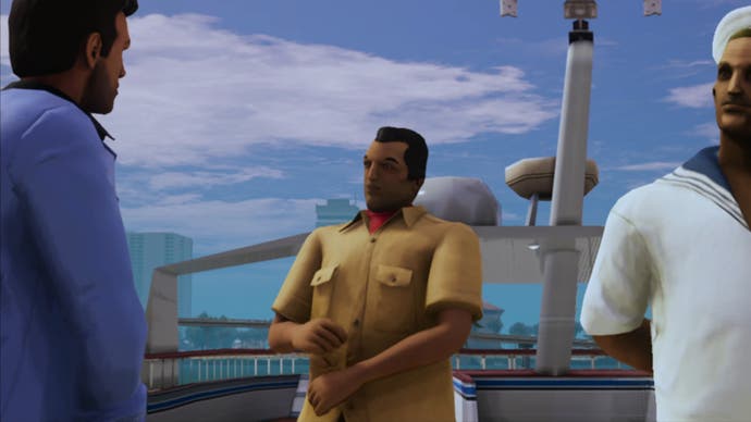
It's nice to see that these games' lighting has been improved, but the Definitive Editions still have substantial issues. Bringing PS2-era titles to PS4-era standards required the replacement, or enhancement, of virtually all game assets, which came with a variety of problems. The characters are probably the most infamous example. They sport a lot of extra geometry, including fully-modelled fingers and more detailed faces. But the animation data remains largely the same as the original titles, so they look awkward in motion, while the PBR materials treatment on them makes them look like they are made out of clay. Making these models look suitably detailed and natural was always going to take an immense amount of work, so I don't blame the developers for achieving substandard results at all, but the final outcome isn't very good.

Textures are the other sore point. The brand-new texture art that is here mostly holds up ok, but looks awkward plastered over some of the flat building faces in these games, which generally speaking have unchanged geometry from their PS2 predecessors. Some of the materials have a slightly awkward specular response too.
However, the most obvious issues - and the object of much player ire - comes from the AI-upscaled artwork that is used heavily throughout these games. As a technique, I think AI upscaling can be a useful tool to achieve good-looking texture art, especially when remastering an older title. The problem is that the texture art in the original game wasn't high-enough quality to work effectively when AI upscaled. To be fair, a lot of the original art - particularly signage - has been fully redrawn. This came with its own issues however, as many of the signs contained spelling errors. Most of these have been fixed but some remain.
As far as I can tell, there have been no improvements to basic asset quality since the 1.04 patch. The iOS port, perhaps unsurprisingly, seems to be based on that patch or a more recent one, given the revised artwork and the presence of certain effects like the smog textures in San Andreas. However, we haven't seen any obvious additional art changes on top of that patch, and there are clear areas for improvement.

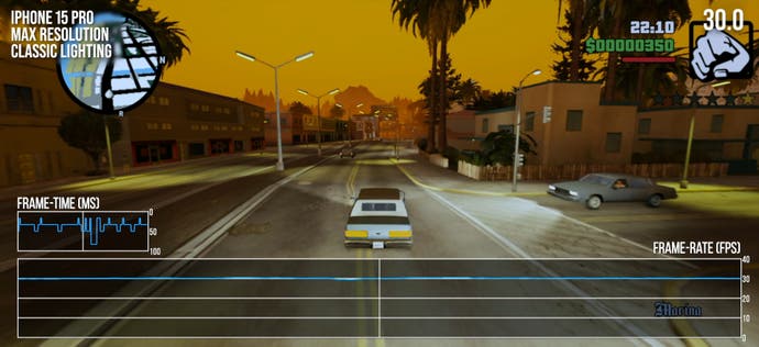
Performance in these new titles is okay by the standards set by the prior Definitive Edition releases, but it could be better. All games are limited to 30fps, but exhibit some pretty nasty frame-pacing problems, both on the device and when output to an external display. There are a mix of frame-times, mostly a pattern of 16 and 33ms frames, with occasional dips to 50ms and below, and some larger stutters in some moments as well. Dropping the settings to their lowest values doesn't seem to help at all unfortunately.
On my iPhone 15 Pro, I couldn't really do anything that would hit the frame-rate significantly. Even driving around in a tank and causing mayhem left me with the same general frame-time readout that I saw when driving around in an old vehicle. All the games perform just about identically here as far as I can tell. Motion blur is retained, which makes the frame-time variance a little less noticeable, though it can't be turned off, unlike the other console versions. Unfortunately, the story is similar in the older Definitive Edition versions, which also suffered from frame-time inconsistencies when capped to 30fps. This is an issue that was present in these titles at launch two years ago, and it's very disappointing that it hasn't been resolved.
There are some issues with compatibility as well. There's no support for PlayStation button icons for those using DualSense controllers, and there's no rumble support on Xbox Series controllers or DualSense. These are common issues in iPhone games, but given their console heritage these games really should have more comprehensive controller support. That said, loading times are the one really compelling performance bright spot. Typical loading times clock in at about two seconds or so - a lightning-quick pace. Even though these are PS2 games at their core, these titles have some fairly heavy revised assets, and the iPhone loading times are quite impressive.
The new Definitive Edition releases on iOS are a mixed bag. They feature a greatly improved lighting presentation relative to the other DE releases, with much closer fidelity to the original PS2 games. The visual cutbacks are reasonable and not especially noticeable on a smaller mobile device. However, performance is unfortunately just not good enough, with highly unstable frame delivery despite their 30fps caps.
If you are interested in playing these games on the go, I think this collection probably offers the best portable experience at the moment, however. The other alternative on iOS would be the original GTA Trilogy ports, released about a decade ago and updated periodically since. These offer high resolution rendering, but suffer from similar performance issues at times, don't have all the effects from the PS2 originals, and can feel a little uncomfortable to control given the lack of proper right stick camera control in GTA 3 and Vice City.
The other upside of this collection is that it's available without additional cost, as long as you have a Netflix subscription. The games can also be bought separately, but for many people these titles will essentially come for free. So, in a lot of ways, these new Definitive Editions are a success, translating eighth gen console code to run effectively on mobile devices - it's just a shame that performance couldn't be smoother.
"auto" - Google News
December 23, 2023 at 10:25PM
https://ift.tt/XYVrCTJ
Grand Theft Auto: The Trilogy - The Definitive Edition tested on iPhone - Eurogamer.net
"auto" - Google News
https://ift.tt/BzPCxOs
https://ift.tt/EHnL5Xg
Bagikan Berita Ini


0 Response to "Grand Theft Auto: The Trilogy - The Definitive Edition tested on iPhone - Eurogamer.net"
Post a Comment